Analytics Blog

Meet Tableau’s New ETL Tool: Tableau Prep
Admit it, in order to analyze your data, you’ve spent hours porting data into Excel to fix/modify it, filter out irrelevant, bad or test records, enhanced the data by adding additional fields from other data sources using vlookup, added calculated fields, etc. And once tomorrow’s, next week’s, or next month’s data arrives, you have to do it all over again.
Some studies show that data analysts spend 80% of their time cleansing and prepping data and just 20% on actual analysis.
Some studies show that data analysts spend 80% of their time cleansing and prepping data and just 20% on actual analysis. Click & Tweet!
As a Tableau Consultant, I’m excited to know that the amount of time I spend doing data prep and cleansing is about to end, allowing more time for the good stuff — analysis!
Tableau is Changing Face of ETL
At the 2016 Tableau Conference, Tableau gave a demonstration of an ETL tool called Project Maestro (as of release in April 2018 it is called Tableau Prep), which they were in the process of developing. I’ve been impatiently waiting to get my hands on it ever since. Recently, I was invited to do Alpha and Beta testing of Tableau Prep and I am excited to share with you what Tableau Prep is doing (as of Beta version 1.0) for data management.
What is Tableau Prep?
Enter Tableau Prep. In order to be able to answer questions with your data, you must have data that is accurate and clean.
Tableau Prep is an ETL tool (Extract Transform and Load) that allows you to extract data from a variety of sources, transform that data, and then output that data to a Tableau Data Extract (using the new Hyper database as the extract engine) for analysis.
How Does Tableau Prep Work?

Tableau Prep helps you examine and visualize your data, enabling you to do the following:
- Connect and extract data
- Understand data:
- Number of columns/fields in your data
- Number of records
- Data types of fields
- Number of distinct values in a field
- Visualize how the data is distributed by field
- Identify issues and errors
- Clean/Modify and Filter data
- Rename fields
- Remove fields
- Modify/change values in a field
- Split fields
- Aggregate data
- Filter out data
- Enhance data
- Add Calculated fields
- Join additional data
- Union additional data
- Output resulting data for use in analysis and reporting
And, once you get new data (as long as it is in the same format and same field names), the ETL process you created is reusable. No longer will you have to repeat the process and steps necessary to transform your data each time the source data is updated, instead the ETL process flow has all the steps and logic you built. All you need to do is re-run the flow to get the new data output, resulting in many hours saved from data processing and cleansing, which can be used for analysis instead!
No longer will you have to repeat the process and steps necessary to transform your data each time the source data is updated… Click & Tweet!
Tableau Prep is fairly intuitive, allowing you to visually see the steps of your ETL process from extracting data from the source(s), to data profiling, modifying and enhancing, to output. It uses common functionality such as drag and drop, double click to edit, and drop down menus to select actions to be performed.
Connect to Your Data
As mentioned previously, Tableau Prep allows you to extract data from numerous sources:
- Microsoft Excel
- Text File
- Amazon Aurora
- Amazon Redshift
- Aster Database
- Denodo
- EXASOL
- Google Cloud SQL
- HP Vertica
- Kognitio
- MemSQL
- Microsoft SQL Server
- MySQL
- Oracle
- Pivotal Greenplum Database
- PostgreSQL
- Teradata
Once connected to your data, you can:
- See field names in the data
- See sample values of those fields
- See datatype of each field – For Text Files only, you can right click on the data type to modify it
- Exclude fields – uncheck the box next to the name to exclude the field
- Filter the data – right clicking on a field name allows you to create a formula to include/exclude records based on the formula (If you are already familiar with Tableau most of the functions you use for Calculated fields are available). Click on the Filters tab allows you to see all the filters you have created.
Depending on the data source, other options might be available. For Text Files, you can select:
- Whether the first line contains header or to Generate field names automatically;
- Field Separator;
- Text Qualifier;
- Character set;
- Locale
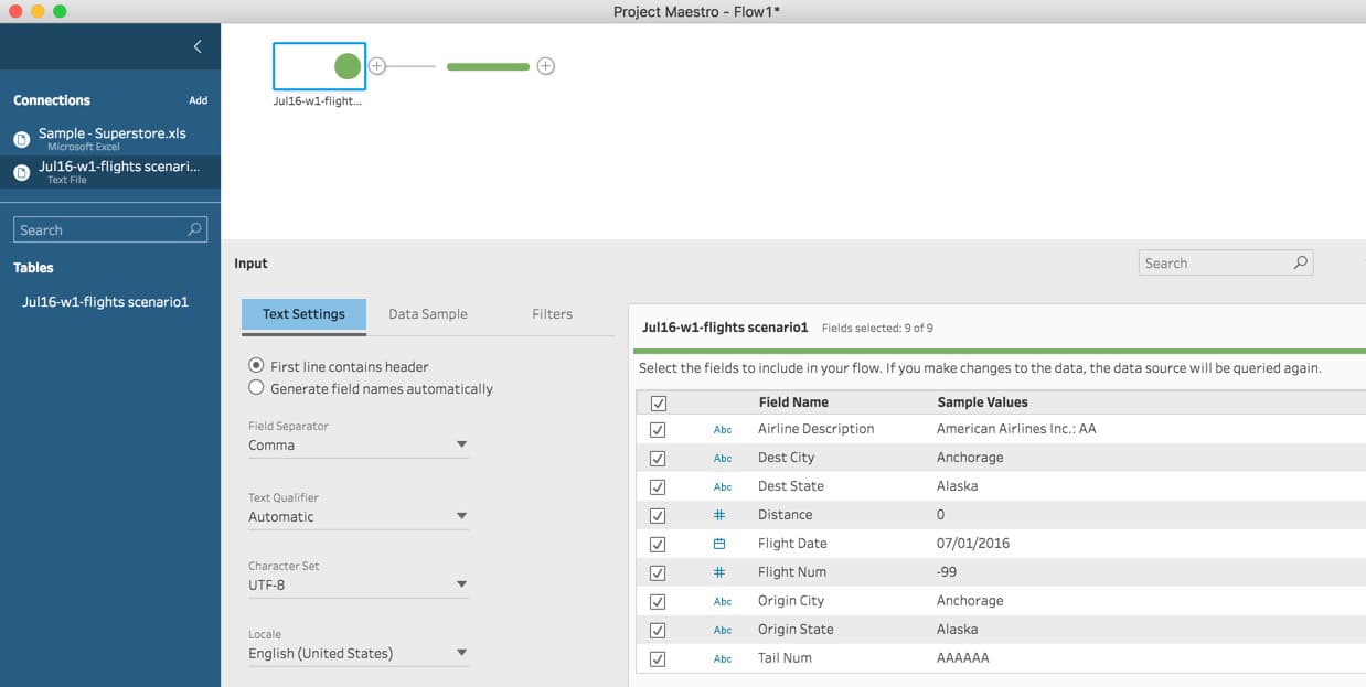
Example of a Text File connection:
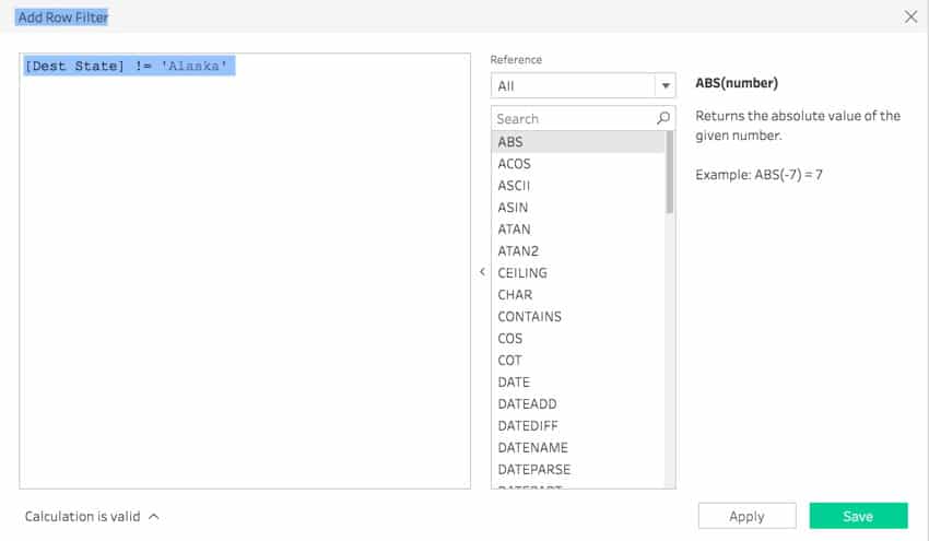
Example of Filtering data in a Text File (exclude all records where the Dest State is Alaska):
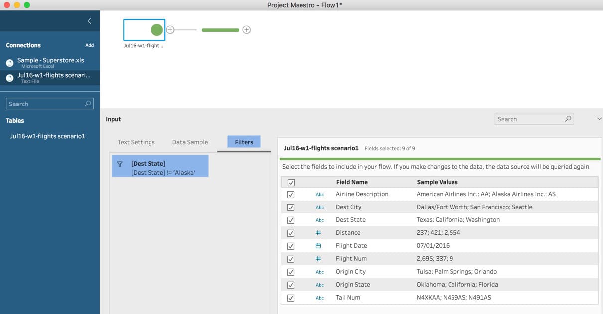
Example of seeing filters that have been applied to a Text File by selecting the filter tab.
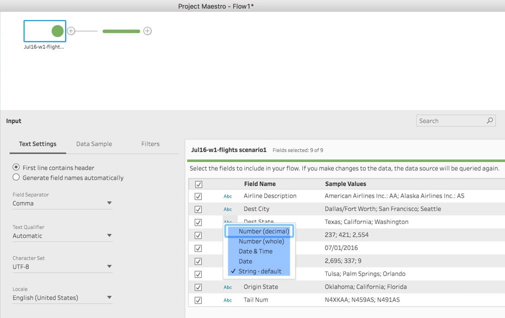
Example of how you can change a data type in a Text File:
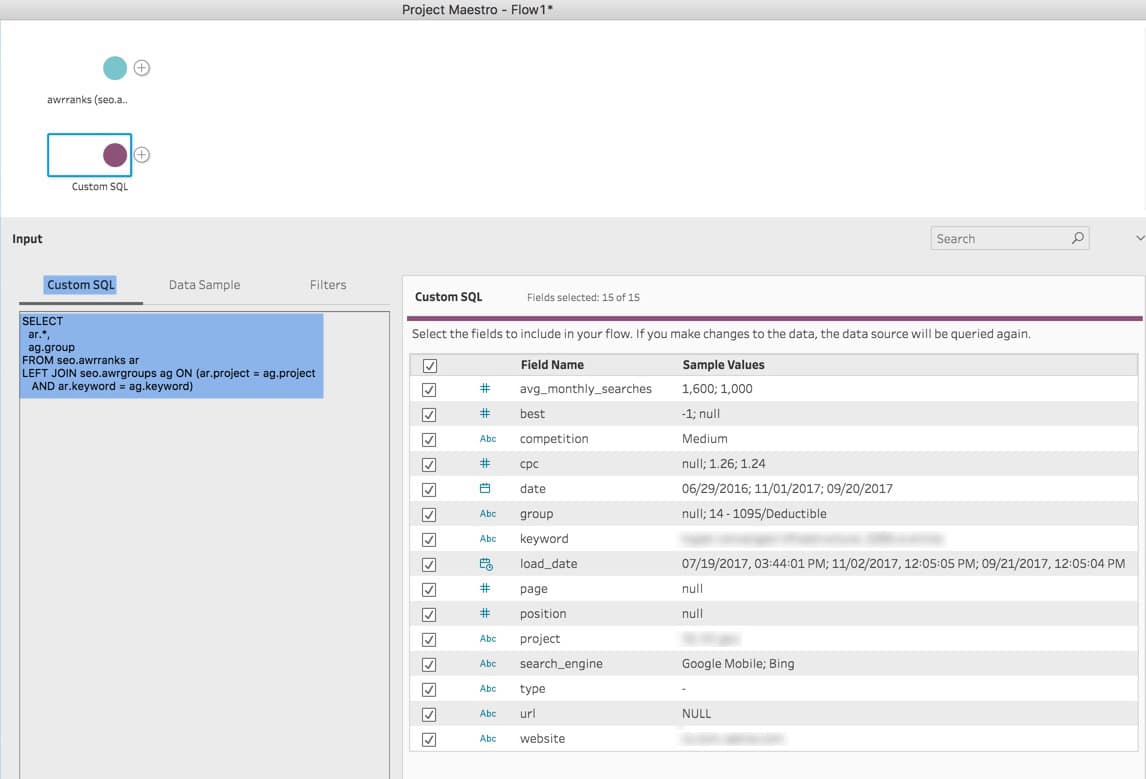
Example of connection to Redshift selecting a specific table (Note: you can select one table, and later use Tableau Prep to Join or Union other tables (or files), or you can select Custom SQL and create your own SQL statement which joins/unions various tables as needed to get the data you desire):
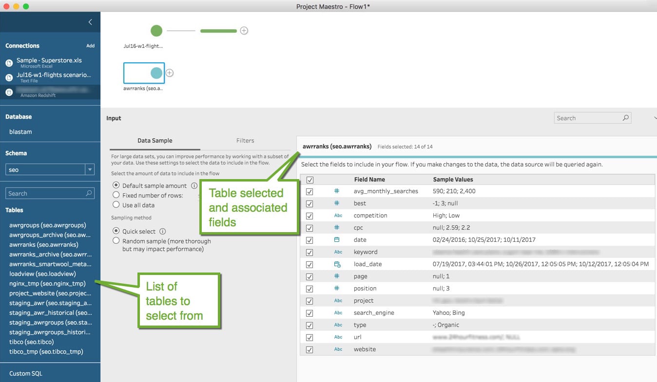
Example of connection to Redshift using Custom SQL:
Understand Your Data
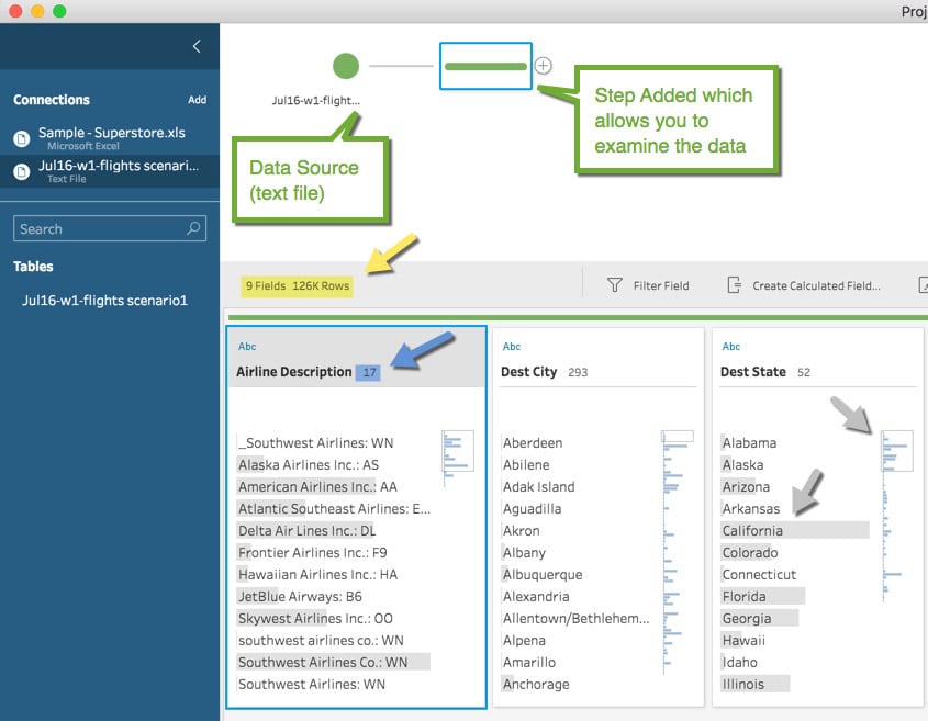
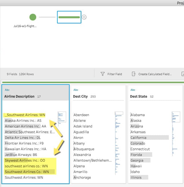
After you’ve connected to your data, Tableau Prep lets you see and analyze your data quickly, perform data profiling, visualize how the data is distributed, and allows you to quickly identify issues. In the example below, you can see:
- The data being examined has 9 columns and 126K rows (see yellow arrow)
- The column Airline Description has 17 distinct values (see blue arrow)
- For the field Dest State (see grey arrows), you can easily see that California is the most frequent value for Dest State (Notice the grey bar over California, which is much longer than any other State. In addition, just to the right of that, you see a miniature bar chart which shows all the States (not just the 12 of 52 displayed) and from that you can see California is the most frequent value for all Dest States in the data set)
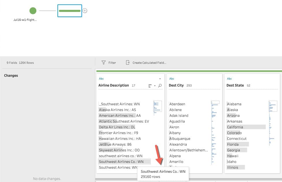
Details about how many records have a specific value (hovering over Southwest Airlines Co..:WN in the Airline Description field shows there are 29,160 records with this value)
See record level details when you select a value from a field. In the example below Delta Air Lines Inc., from the Airline Description field was selected.

You can quickly see that Georgia, in the field Dest State, has the most records associated with the Delta Air Lines Inc. selection, as indicated by the length of the light blue bar compared to California, Florida, and the other States displayed in the Dest State field. In addition, the Distance for these records mainly fall between 0 and <1250 miles (again identified by the length of the light blue bars in the Distance field).
Identify Issues and Errors
As you analyze your data and how it is distributed, you may identify issues or errors. For example:
- Southwest Airlines has four different ways of being displayed (see yellow arrows):
- _Southwest Airlines:WN
- southwest airlines co.:WN
- Southwest Airlines Co.:WN
- Southwest Airlines:WN
Using Tableau Prep’s data view allows you to quickly identify:
- Bad data that needs to be cleaned or removed
- Inconsistent data (data that doesn’t follow naming conventions, has typos, etc.)
- Outliers that may not be relevant to your analysis
Clean/Modify and Filter the Data
Once you find an issue with your data Tableau Prep can help you clean/modify or remove it.
In the example above, we found there are four versions of Southwest Airlines, and Tableau Prep offers three different ways to fix this.
- Click on the value to be changed, and select “Edit Value” and modify it to what you desire and all records with that original value will be modified to the new value.
- Click on the correct value and then select Group and Replace – Manual Select from the field menu. A new window appears with all the distinct values in the field. Select the values that should be changed to the value selected initially. All related records for all the values selected will be modified to the initial value selected.
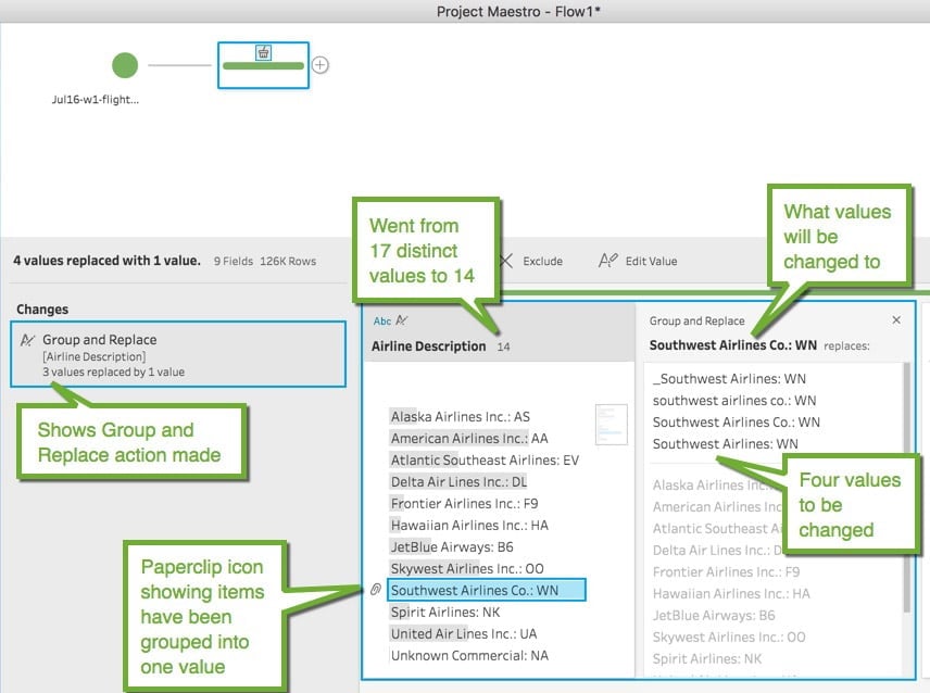
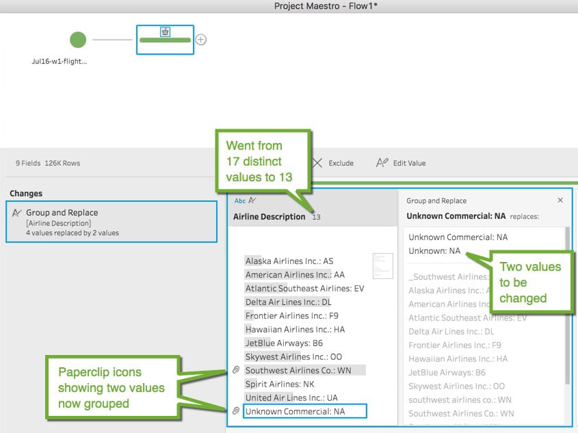
- Select Group and Replace – Pronunciation from the field menu. Tableau Prep will look through all the distinct values and using machine learning, it will find values that are similar in pronunciation and group them into one value. You then have the option of looking at the grouping(s) and revising as needed (you can remove a value from the group if it doesn’t belong). In the example below, using the Group and Replace – Pronunciation, the Southwest Airlines values have been grouped together and the Unknown values have been grouped together, all done automatically. Pretty slick!
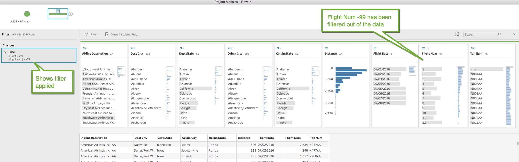
Another example is finding data that should be removed because it is bad, irrelevant, or test data. Records can easily be removed using Tableau Prep’s filtering. In the example below, we discover there are 192 rows that have a Flight Num of -99, which is an invalid Flight Number. Looking at the detail records we see they are all exactly the same (same Airline Description, Dest City, Dest State, Origin City, Origin State, Tail Num and all have a Distance of 0 miles). We don’t want to include this in our data, so we apply a filter by selecting Filter Values from the field menu. It brings up a window allowing you to create a formula to include/exclude records based on the formula (If you are already familiar with Tableau most of the functions you use for Calculated fields are available).
Before the Filter:

After the Filter:
If you have the need to aggregate your data, for example you have daily data but you would like to aggregate it to a monthly or yearly level, Tableau Prep allows you to do this. Select the step in the flow you would like to aggregate from, right click on that step and select Add Aggregate. A new step will be added and you can choose what level you want to aggregate your data.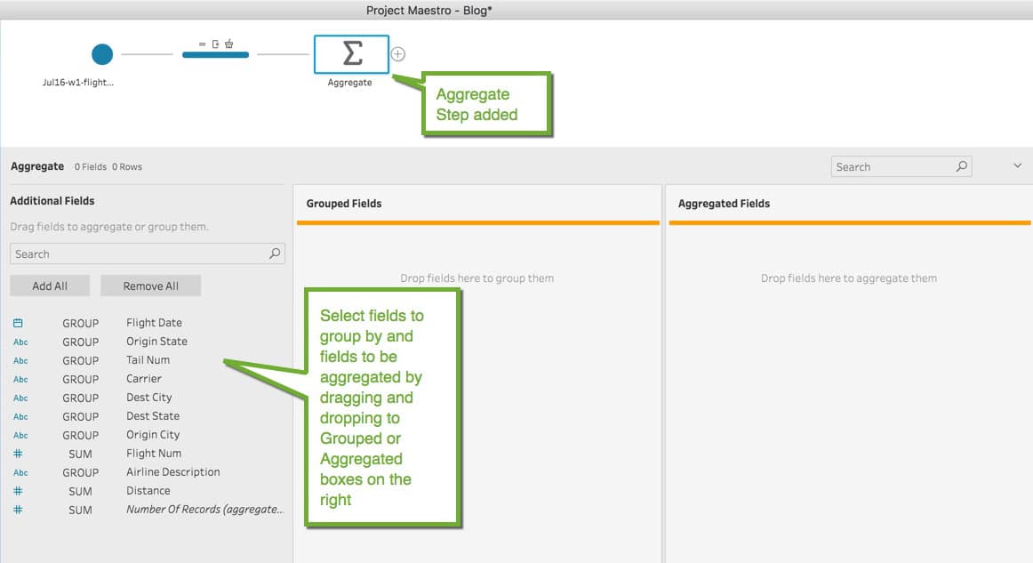
I want to aggregate the data by Airline Description and Flight Date, and then aggregate the Distance, Number of Records, and get a distinct count of the Flight Numbers. By dragging and dropping fields, you get the following:
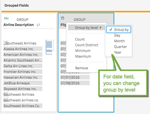
One area to note, if you use a date field in the group by, you have the option of determining the level you would like to group the date:
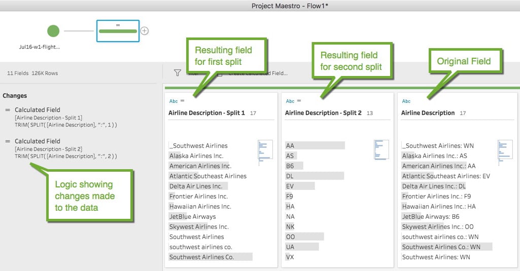
You also have the ability to split data out of a field into other fields. In the example, Airline Description contains the Airline name and the Carrier Acronym. You can easily split the data into two separate fields using the Split function found in the field menu.
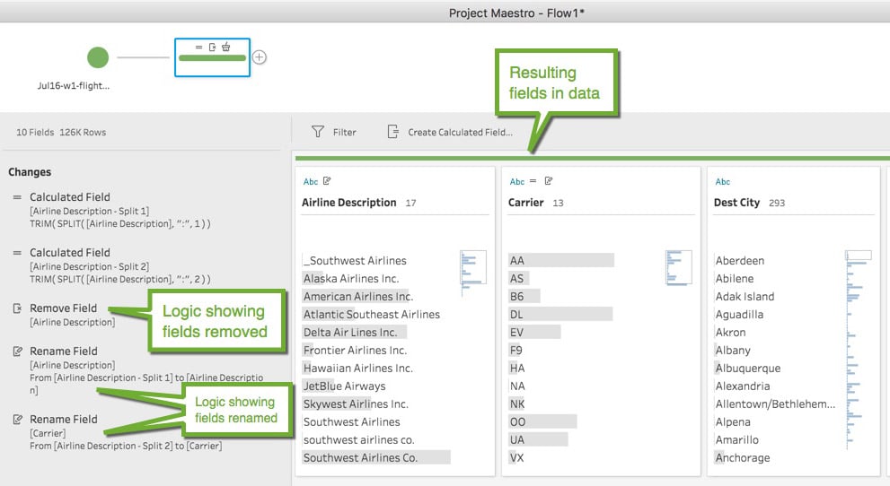
Lastly, you can rename fields and remove fields. Using the example above, after the split is complete, we no longer need the Airline Description field so we can remove it using the menu in the field name and selecting Remove Field. And we can rename the two split fields by double clicking on the names and modifying.
Enhance the Data
Tableau Prep also provides the ability to enhance the data by creating calculated fields, adding additional data via a Union, or extend the data by Joining additional data.
To add a calculated field, just select the Create Calculated Field menu item. A window appears allowing you to create a new field using formulas that can utilize other fields in the data set, constants, or whatever logic you deem appropriate. If you are already familiar with Tableau, most functions found in Tableau are available in Tableau Prep, and they use the exact same logic. If you are familiar with Excel functions, you will easily be able to port over your knowledge of Excel functions to functions in Tableau Prep/Tableau.
Performing a Union of data is as simple as dragging and dropping the files you want to Union together. As an example, you have weekly data that is sent to you in CSV files. For your analysis, you need the full month’s data. Using Tableau Prep, you can Union the four weekly monthly files and output the results.
Tableau Prep’s Union logic looks for fields with the exact same names, and the data is appended accordingly. Those fields with unique names become their own field in the resulting data set, but you have the ability to “merge” fields in case they hold the exact same data only the field names are different.
Step 1: Get the files (or tables) you want to Union
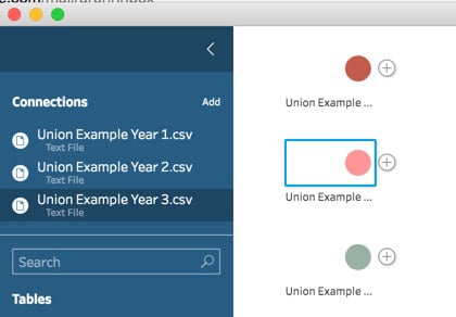
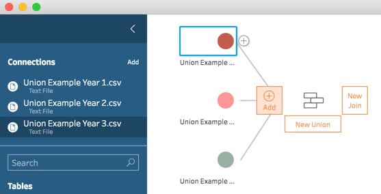
Step 2: Drag and drop one file/table on to another and select New Union

Step 3: Drag and drop another file/table to the resulting Union step and select Add:
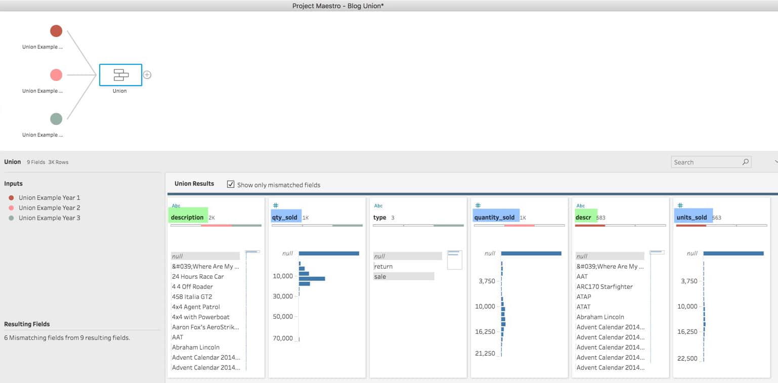
You can do this for as many files as needed. When done, select the resulting Union to view the results. Tableau Prep provides detailed information on the resulting Union:

A – release_year field exists in all three files (three colors in bar match file sources color)
B – description field only has two colors (matches Union Example Year 2 and Union Example Year 3)
C – qty_sold filed only matches one file (Union Example Year 3)
By selecting the Show Only Mismatched Fields box, you have the opportunity to fix any mismatches that may have occurred. In the example below the fields “description” and “descr” (highlighted in green) are the same and should be merged under description. In addition, fields qty_sold, quantity_sold, and units_sold (highlighted in blue) are the same and should be merged under quantity_sold.
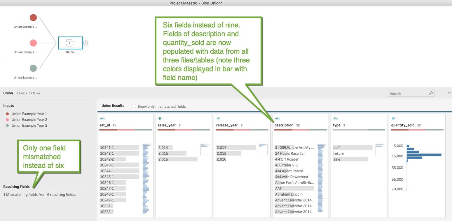
To merge, simply drag and drop the field to be merged onto the one that it is to be named. The end result are as follows:
Lastly, Tableau prep lets you Join data from different sources, be it joining data from a file to a database table, tables from different database (i.e. join an Oracle table to a Redshift table), or any combination, it the same process as doing a Union. Drag one file/table on to another, but select Join instead of Union. The resulting screen lets you choose what fields should be used in the Join and whether the Join is to be an Inner, Outer, Left, or Right.
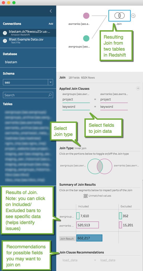
The ability to see what data is included or excluded from each source is extremely helpful in troubleshooting. Perhaps one of the fields from one of the sources used in the join has some incorrect values. By selecting the Exclude bar for the data source you can examine AND fix the data. This can save hours of painful research!
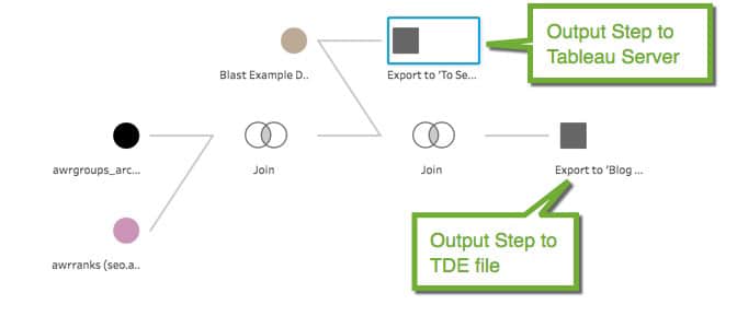
Output the Data
Last, once you are ready to output your data, you simply click on the step you want to output from (as you can have more than one output from an ETL flow) and select Add Output. The output is to a TDE file (Tableau Data Extract) or you can have it published directly to Tableau Server.
 Improvements I’d like to See
Overall, for a first product release, Tableau Prep has made a nice start for an ETL lite tool. You can do so much and do it easily. No more Excel filtering, find and replace macros, vlookups to add data, etc. Instead you have an intuitive tool that is easy to use, very powerful, allows you to easily see each step and all the changes you’ve implemented (so they can be removed, modified or added to if needed), and automates the process once you’ve created an ETL flow. But I’d like to see the following to advance it to the next level:
- Add a scheduler. For any ETL, you need the ability to schedule when new data should be retrieved. Whether it’s a daily pull, weekly, or month end, you need an automated process to be able to pull data so you don’t have to do it manually. And you’ll need the ability to specify what date range (or some key that identifies new records) should be extracted on each new scheduled ETL process.
- Output to CSV or Database. Currently you can only output to TDE or Tableau Server (though oddly enough TDE and Tableau Server isn’t an option for input, what’s up with that?). I’d like to be able to output to a CSV file so I can then load the resulting data into the database of my choice (Redshift, Aurora, SQL Server, Oracle, etc.) allowing me to build a data warehouse. Or better yet, let me output directly to a database, letting me choose the schema and table the data should be loaded. And, for loading to a database, I’d need the ability to indicate whether the data should append to existing data, update existing data, or replace existing data, etc. (Note: Beta 2.0 now includes the ability to output data to CSV, TDE, and Hyper TDE files.)
- Ability to pivot data. Some Text files don’t come in the most useful format. In Tableau you have the ability to pivot data from Text or Excel files. In fact, the whole data interpretation that Tableau can do to remove rows that aren’t related to data would be great! (Note: Beta 2.0 now includes the ability to pivot data.)
- Ability to connect to more data sources. Tableau has many more data sources that it can connect with, Tableau Prep should have the same and more.
Final Thoughts
I don’t know what the price point will be, or if Tableau Prep will come with your license, but hopefully Tableau will do us a solid and it will be reasonable. Your company may not be able to afford an Informatica license, or some other high-end/expensive/complex ETL tool, but Tableau Prep will most likely be able to meet your needs, without requiring a tech savvy individual to utilize it.
Just like Tableau put data, analysis, data visualization and dashboards into the hands of anyone, Tableau Prep will put the ability to perform ETL into the hands of everyone. (Dang, that last line is pretty good! Maybe I should trademark it in case Tableau wants to use it…just sayin’)
Related Insights

Digital Analytics


If you have questions or you’re ready to discuss how Blast can help you EVOLVE your organization, talk to an Analytics Consultant today.
Call 1 (888) 252-7866 or contact us below.